
Were you hungrier than you thought you were at that restaurant with the richly painted crimson walls? Did you feel particularly calm in that corporate reception area with sea foam-colored wallpaper? Perhaps you didn't immediately notice the physiological effects that the colors in both places may have had on you, but chances are you did experience a shift in appetite or mood induced - or enhanced - by the shade of your environment.
The effects of color on human behavior have been researched by everyone from psychologists to interior decorators. From the ancient Egyptians onward, people have used different colors to illicit different moods and feelings. The ancient Egyptians revered the deep blues and greens of the River Nile, and used blue faience tiles to suggest water running along the floors of their palaces and temples. In the minds of ancient Romans, the color purple was so closely associated with royalty that only Caesar and certain noblemen were allowed to wear it. In more recent times, residents of psychiatric hospitals were thought to be soothed by shades of pale, "institutional" green.
While color is a science, it is not a "hard" science. Rather, it is shaped by human perception - as well as individual preference and experience - so that a certain shade of blue may well induce different feelings and reactions in you than it does in someone else. One means of discussing color and its effects on mood and design is the Bourges system of colors. Developed by graphic artist Jean Bourges and used by many university graphic and interior design programs, the Bourges system divides all colors visible to the human eye into four main groups (reds, yellows, greens, and blues) and quantifies their effects based on both research and common sense.
For example, the red group - which includes scarlet, crimson, pink, and mauve - is considered a "charged" family of hues, inspiring passion and strong feelings. Our eyes pick out reds more readily than any other color, which is why it's used for stoplights and hazard signs.
The Bourges system goes on to ascribe certain intangible moods and attributes to various colors. According to studies done at San Diego State University, viewers generally felt the warm browny-gold of amber to be "mellow, abundant, and fertile" "like beer or wheat fields" or "the color of expensive perfume."
Emerald green, on the other hand, inspired adjectives like "brilliant," "expensive," and "eternal," but while viewers felt that the deep green of emerald denoted gem-like splendor and richness, the color was also associated with jealousy and the color of poison.
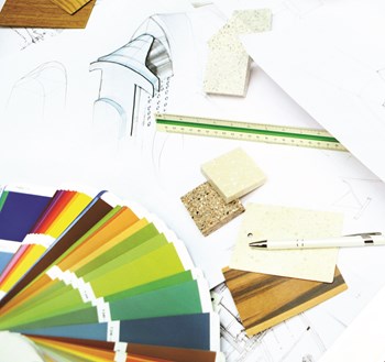
For all its subjectivity and abstractness, for co-op and condo boards looking to remodel a lobby or hallway, giving some thought to color is an important step in the process. If you are working with an interior designer, most likely he or she will educate you in the ABCs of color theory, but here are a few more things you might want to know beforehand.
Although any professional will stress the fact that there are no hard and fast rules that apply to color, there are a few generalities that most interior designers agree upon when it comes to determining what sorts of colors make people feel certain ways.
Colors that are perceived as inviting or "homey" are generally warmer colors like creams, yellows, roses, and greens. Earth tones - such as beiges and neutral browns - also create a welcoming effect. Some lab studies have indicated that viewing warm colors actually increases the viewer's pulse, making people literally feel one or two degrees warmer in a warm-colored environment. Likewise, colder colors - like ice blue, blue-violet, and gray - may decrease a person's pulse.
Other colors seem to affect the mind and body in different ways; blue inspires calmness, greens encourage peacefulness, certain yellows trigger cheerful reactions in some (while inspiring surliness in others), and red stimulates hunger and salivation.
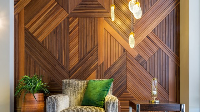
Of course, besides affecting a person physically or emotionally, colors also serve to create a certain "look" or aura. For example, colors that convey sophistication or affluences include purples, burgundies, navy blues, and the "deeper, jewel tones," according to Suzen Heeley, an interior specialist and president of SH Design in Manhattan.
And yet, according to Rebecca Alston, president of interior design firm Rebecca Alston, Inc. - also in Manhattan - people currently seem to favor fresher, lightened-up versions of these more traditionalist "Connecticut" hues. "People are tired of the heavy, historical, smoky blues. Today, lighter versions of the traditional colors are more in demand. You're not going to see as much of the deep reds, blue violets or saturated oranges that dominated the 90s. Now it's those colors, only lighter and more open."
In contrast, hip or trendy colors currently in vogue include harvest gold, avocado, lime green, and "a lot of retro colors, like the colors of appliances in your parent's kitchen," says Heeley.
Alston adds that khaki is also making a comeback. "People like that color around them. It can also be beautifully combined with other colors, like blue. Khaki is an environmental color - it's more subtle."
In the end, however, "color becomes a self-fulfilling prophesy," says Michael Love of Interior Options in Manhattan. "The "˜in' color of the season is basically whatever magazines are saying it is."
The tone of a color, and how colors are mixed, should also be taken into consideration when weighing design choices. "You have to think about the value of a color. A bright Kelly green might not have the calming effect of a pale green," says Heeley. "Certainly, the tone and value of a color - as well as the amount of color - is very important to physical response and emotion."
Alston adds that "Color combination has the most impact. It's how you put the colors together. You could always put a warm and cool color together and counter what the actual physical repercussions are." The texture of a material also affects the way that its color appears. A pearl or satin finish, say, on drapes or wallpaper, has a more sophisticated look than crude cottons or other unfinished fabrics.
Remodeling is more often than not a team project, the principal players being the co-op board and an interior designer. Because of the various tastes and experiences represented in a board, the job of guiding the process along is not always easy for a designer. Likewise, a board might resent being told what it is looking for by an outside voice. For this reason, it is best for everyone involved to do their part to enable an open, fruitful dialogue, and - perhaps most importantly - to be willing to listen.
Love says that she often begins the design process by asking the co-op board "an awful lot of questions."
"I also look around and see how they live, so I'm not just listening to what they're telling me. I try to read between the lines. Usually, the first thing I ask when we get into color is what colors they don't like. People tend to feel more certain about the colors they do not like as opposed to the ones they like."
Specifying colors and tones is also an important step, says Love. "I'll ask them what they mean by "˜yellow' or "˜green' or "˜blue'. Bright blue? Navy blue? Greenish blue? It's a probing process."
Heeley says that she usually begins by asking the board for a point of reference. "If they say that they want a Ritz Carlton look, that immediately conveys an image. Others might say they want more of a Southwestern look. I usually start by asking people to bring in photographs of existing buildings that they like."
Alston offers her clients as many as three different preliminary design schemes or mock-ups, either computer generated or drawn by hand, to give them an idea of what directions they can go in. "Design schemes show a board the options they have, whether it's Classical, Modern, or Art Deco. It's helpful because the images are based on their building's exact space."
A test study - in which a small section of the actual wall is painted - is another helpful way to envision the way a color will look. Designers advise testing colors in a corner so that if there are any adjacent wall colors, the two tones will be side by side, the way they would actually meet. You can also examine a new color by looking at it through a rolled-up paper telescope so that the rest of the room is blocked out.
Despite all these measures, a co-op board/designer relationship is not always smooth sailing. "You have to build a trust with board members, which is frequently difficult because everyone is pushing and pulling on the design," says Alston. "Dealing with an individual is one thing, but once you've got ten people or more, it becomes harder to discuss things - and some people do not want to listen."
Love agrees. "It can be like working with a married couple who don't like the same things," she says. "You have to find the common ground first."
As with any relationship, a successful board/designer partnership often involves compromise. Love offers an example: "I'm working on a building right now that has a very good marble floor in the lobby. In the middle of it there is a big central design in terracotta, and several board members can't stand the terracotta. They want it out of there, but they don't have the budget to remove it. What I'm suggesting is working on the fabrics and wall color in the room, so that the floor becomes more of a composition and doesn't stand out like a big blob."
Another way to resolve disagreement is to introduce an objective arbiter, such as a focus group made up of potential buyers or people who have recently purchased apartments in the building. "You can present the groups with sample boards or renderings that show the space in different ways and get their reactions," Heeley says. "You can do it formally with a moderator, or in a less formal way, with board members there asking questions and getting feedback. An outsider often sees it differently, and it's important to get that fresh eye."
Whether your goal is to convey stately affluence, down-home hospitality, or cutting-edge chic, the colors you and your designer choose will set the tone (both literally and figuratively) for the space. Color is to be taken just as seriously as building materials and finishes - the right color can be worth a thousand Italian marble tiles.
Comments
Leave a Comment